

TL;DR
The outcome:
3-day technical assessment: designed fintech platform simplifying investment tracking and trading
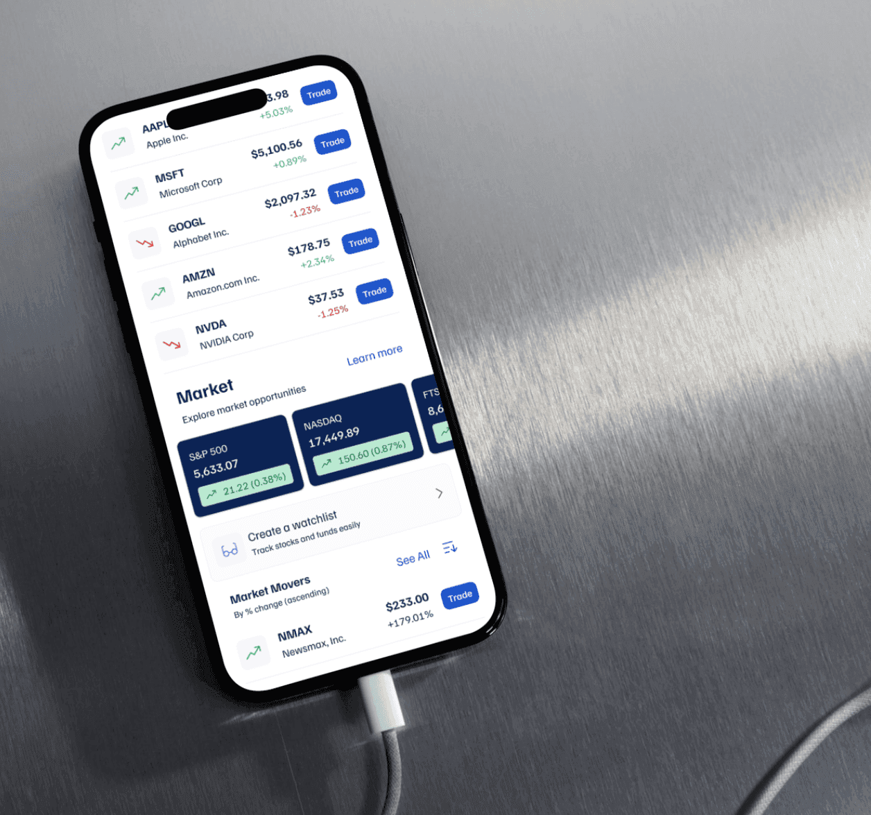
Single-screen portfolio overview with integrated buy/sell functionality
Used Claude for design evaluation and Perplexity for research insights
Competitive analysis of Robinhood and Fidelity to inform design decisions
Successfully met 2 user stories with clean, modern interface
What went wrong: Technical assessment constraints (3 days) meant no real user testing—Replaced primary research with AI-assisted secondary research. Couldn't validate if suggested improvements (AI-powered recommendations, financial education) actually address real user pain points. Designed for "active investors" but never interviewed to confirm assumptions about simplified UI being valued over feature depth.
What I learned:
Time-boxed design challenges force prioritization—I focused on core flows over comprehensive testing
AI tools accelerate research but can't replace user interviews
Competitive analysis reveals patterns (Robinhood = simple, Fidelity = comprehensive) but doesn't tell you which approach users prefer
In fintech, visual polish matters—used Fluent 2 iOS + shadcn/ui for professional aesthetic
Main challenge
Context:
Technical assessment prompt: Design investment app addressing industry UX barriers. McKinsey data: 56% dissatisfied users cite UX/UI issues (confusing journeys, inadequate information architecture). 65.8% of non-users intimidated by financial complexity and jargon.
My hypothesis:
Single-screen portfolio view with integrated quick-trade functionality would reduce navigation complexity and lower barrier for users uncomfortable with traditional investment platforms.
The constraints that shaped everything:
Timeframe: 3-day technical assessment (research, wireframes, high-fidelity design, presentation)
No user access: Couldn't interview or test with real investors
Research limitations: Secondary data only (surveys, competitor teardowns)
Competing with established players: Robinhood (simple) and Fidelity (comprehensive)
Balance challenge: Simplicity vs security perception in high-stakes financial context
Two primary usability challenges identified:
Financial complexity/jargon: Specialized terminology alienates users without finance backgrounds
Trust and security: "Too easy" interfaces may signal lack of security—need balance
Day 1: Problem alignment Research via Perplexity, competitive analysis, identified opportunities Day 2: Exploration Moodboard, UI kits, manual wireframes exploring dashboard + trade flows Day 3: Solution alignment High-fidelity design meeting 2 user stories, documentation of follow-up improvements
Key design decisions
Single-screen dashboard: Portfolio value, performance chart, holdings list—reduced cognitive load vs Fidelity's multi-tab approach
Integrated trade actions: Buy/Sell buttons directly on dashboard (inspired by Robinhood's quick access), workflow keeps context
Professional aesthetic: Blue gradients signal trust and stability, Fluent 2 iOS components for native, polished feel
AI-assisted design validation: Used Claude to evaluate acceptance criteria compliance and Gemini for color hierarchy analysis
Proposed enhancements (documented but not designed):
Transaction history with open/completed orders
Recurring investment feature (competitor parity)
Financial education: explain order execution, fees, price differences
AI-powered suggestions based on portfolio sectors
What went wrong?
Designed for "active portfolio managers" but also "users without financial backgrounds"—these are contradictory personas. Active managers likely want Fidelity's depth, not simplified UI. Never resolved who I'm actually designing for.

About design sprints: 3-day technical assessments teach prioritization. I chose visual execution quality over research breadth—showcased craft but sacrificed validation. In real product work, I'd push for at least 5-10 user interviews even with tight timelines.
About AI-assisted design: Claude and Perplexity are powerful for rapid research and evaluation, but they don't replace talking to users. AI can analyze flows and find statistics—it can't tell you if your solution solves a real problem users would pay for.
About competitive analysis: Studying Robinhood + Fidelity revealed two extremes: gamified simplicity vs comprehensive data. But observing competitors doesn't tell you which approach users prefer or if there's a middle ground. Need user validation to choose direction.
About fintech trust: Visual polish matters in finance. Using Fluent 2 iOS and shadcn/ui created professional aesthetic, but trust comes from more than design—brand reputation, regulatory compliance, customer support. UI can't solve trust alone.
For next time:
Be explicit about who target user is—don't design for everyone
Define differentiation beyond "better UX"—what's the unique value?
Document what I DON'T know due to time constraints (shows self-awareness)
Suggest specific validation plan for follow-up phase


